Group member Laura's second video diary 'What has been your weakness whilst filming?'
Monday, 2 May 2011
Video diaries Holly
Group member Hollys second video diary, 'What has been your weakness whilst filming?'
My second video diary
My second video diary, 'What has been your weakness whilst filming?'
Again I was trying to say that our organisation could have been better, and that we could have planned to stick to our time schedule more rigidly.
Again I was trying to say that our organisation could have been better, and that we could have planned to stick to our time schedule more rigidly.
Video diaries Laura
Another group member Laura first video diary. 'What has been your favourite part of filming?'
Video diaries Holly
Another group member, Hollys first video diary. 'Whats been your favourite part of filming?'
My Video diary
My first video diary "Whats been your favourite part of the film?'"
Basically I was trying to say that I found the use of lighting and colour in our note scene effective, as it ties in with our ancillary task.
Basically I was trying to say that I found the use of lighting and colour in our note scene effective, as it ties in with our ancillary task.
Deviant art feedback
We have added our review page and poster to popular artist website deviant art, hoping to recieve feedback from users. Currently we have one like for each of our pieces of work, so we are hoping for a good response.
We have posted a link to the deviant art page on facebook using another form of new media technology. We hoping to seek feedback from fellow deviant art users.
We have posted a link to the deviant art page on facebook using another form of new media technology. We hoping to seek feedback from fellow deviant art users.
PDF File
To show use of different media technologies, we have converted our poster and review page files into PDF documents, allowing us to publish them online for viewers worldwide to see.
Final Review page
Here is the third draft of our review page we chose to keep the deep purple colourings instead of choosing monochrome, with the final adjustments of:
- The written review
- Image and caption
- Text added to the lower bar, stating running time etc
(click on image to enlarge)
Second draft of review page
We also tried our review page in monochrome, to see if this would give a more professional look. Colour difference is more noticeable larger.
(Click image to enlarge)
Changes made:
- Using the rectangular black and white tool to select the whole image area
- Went into edit drop down menu
- Selected 'cpy merged'
- Went into edit again and pasted the merged layers, so that all the items including text and images were on the same layer
- Went into the drop down menu, image/adjustments/black and white
- This changed the image into grey scale from its previous purple without having to handpick all the individual colours
First draft of review page
Our first draft of our review page (click image to view full screen)
(click image to enlarge)
How it was made:
- Created a new file in photoshop, keeping the file size to what the review would be puiblished in, A4
- An image from our film was placed on our new file as our header image, specifically chosen to depict the film title.
- Chose a lighter colour from the image using the eye dropper tool. With this new colour we used the shape tool to create a rectangle for the header background.
- Text colour was chosen using eye dropper and selecting a darker colour taken from the image, choosing colours from the image enabled us to connect the elements of our poster.
- We repeated these steps for the information boxes in the middle of the page, making the text box darker and the text lighter.
- At the bottom of the page we placed a strip of shots from our film, downsized to 90% less than there original size to fit the width of the page. Giving the effect of a film reel.
- We added text at the very top of the image in a light colour, to tell small details - issue number and date.
Before adding these images to the poster, there were previously edited.
- We duplicated the original layer
- Changed the levels of the image
- Changed the hue/saturation
- Changed the hue/saturation of image again
- Used the curves tool
- Added a colour filter
- Changed the colours on the channel mixer
- Finally we altered the brightness and contrast
Review page initial ideas
Here are a few ideas for our review page so far:
We want to keep our scheme simple for a professional effect, above our some possibilities.
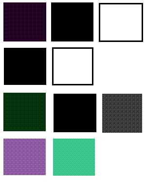
Colour scheme possibilities -- Dark and desaturated
- Monochrome
- Complimentory pastel
We want to keep our scheme simple for a professional effect, above our some possibilities.
Subscribe to:
Posts (Atom)


