Wednesday, 27 April 2011

Extras for poster

To finish off our poster there are a few more features we may wish to add, as illustrated below:


Names of main actors

Quote from review

Slogan

Production information


 Awards

Director

Website

Production company logos


Any special features

Coming soon/ release date

Poster feedback

In order to make appropriate changes,  I have sought feedback on our poster in a few different ways. Specifically I have emailed the poster to a select few who match the ideal target audience member, to ensure our poster is appealing to them. The printscreen shows the attachment and list of email addresses highlighted.

Here are print screens of the emails I recieved back:
This individual felt that the main factor needing work was the copy, and the name of the film itself which I will take into consideration.

Again the only negative was the copy, which both of the individuals felt was not appropriate and did not match the standard of the rest of the poster.
 I have found this useful as it gives me a clearer image of how our target audience percieve our poster, and following this feedback I will make appropriate changes.


In order to receive more general feedback, I have asked twenty people a series of simple questions, shown below: (note that diagrams are used to illustrate majorities and are not drawn accurately)
Do you find this poster effective?
Twenty of twenty people asked said they felt our poster was effective, which tells us we have created something people feel has meaning, important to our film. No change needs to be made here.

What would you say is this posters biggest strenght? (chosen from imagery, lighting, colour, composition, editing, copy)
The majority of people asked felt our composition, and the way our images were displayed centerally to be our biggest strength, closely followed by the images themselves and the results achieved through editing. I feel this is a good result as everyone asked found something visual effective about our poster, and with a few votes for each we can ensure that our poster works as a whole. The only weakness here is the zero votes for copy, which doesn't nesecarily mean its bad but just that other things are better. Our poster is designed to be visual anyway so if we make any alterations to the copy, they will be minor as its not designed to be the focus.

What would you say is this posters biggest weakness? (chosen from imagery, lighting, colour, composition, editing, copy)
Everyone asked felt the copy was the posters biggest weakness, which is both a positive and negative thing. It shows that there are no other major weaknesses from the poster, which is designed to be visual and because copy is one of the least major factors for our poster, any changes will not have to be great. However because everyone asked felt the copy was the posters biggest weakness, we may wish to consider making alterations.

Would this poster stand out against others?
Only one person of those I asked felt this poster would not stand out amoungst others, when asked why they said "The colours could be brighter to ensure it catches your eye". This is something we will take into consideration, we could try slightly brightening the colours, making them more vivid however the gentle, hazy effect we want to achieve could be ruined by doing this, so any changes we make will be very slight as the vast majority agreed it would stand out.
  
Does it make you want to view the film?
Everyone asked expressed interest in viewing the film, which is important as ultimately a poster is selling the product. Although nobody said they would not be interested, I feel there are changes we could make to ensure our film recieves views, such as stating any awards it has won, once we have added the final pieces of information I am confident people will want to watch our film.

What mood and emotions are depicted from this poster? (chosen from happiness, sorrow, anger, confusion, combination, can't tell)
I am very pleased with this result, as the majority of people decided a combination of emotions was being portrayed, which is exactly the effect we wanted as when our character is swinging she feels euphoric yet still remembers the dispair she feels. I am not surprised by the other results, as the blurred image does create a sense of confusion and the pastoral, hazy colours do create a sense of happiness. I am pleased that no one decided anger was portrayed, as despite everything that happens in her life our character is never bitter or resentful. Nobody decided they were unable to decifer any emotion either, which is positive as our poster is portraying several reflecting the girls uneasy life, and the fact that no one selected 'can't tell' shows that they were all able to gain some meaning from our poster.
The questionairre has proven to be a success, as the majority of people sensed and felt exaclty what we wanted them to, with only a few minor alterations that could be made. I asked people what they thought of the poster while its still in its basic form, as our poster works visually and I decided that adding the finishing touches and logos beforehand may draw attention away from this.

Chosen poster strenghts and weaknesses


This is the poster we are going to use, as its the best in terms of imagery and colour. I am hoping to receive feedback on the basic poster design before we add the finishing touches in order to ensure our poster is as visually effective as possible.
Here are its main strenghts and weaknesses that I myself would notice:
Strenghts:
  • Use of colour
  • Effective lighting
  • Image can be percieved on numerous levels
  • Imagery acts as powerful metaphors, e.g. chains imprisionment
Weaknesses:
  • The copy looks bland and uniteresting
  • It could perhaps signify more personalitiy if it wasnt a simple sans serif
  • The colour of the copy could be more effective

Thursday, 7 April 2011

Filming considerations shot reverse shot

Shot reverse shot is a feature of the classical style of Hollywood continuity editing. The character will be shown looking at something, and the camera cuts to what they are looking it. In a conversation, it will cut between the two characters giving the impression they are looking at each other and making the conversation fluid. Using stop reverse shot is important to help audiences gain perspective on a situation, and to allow them to understand.

Filming considerations rule of thirds

The rule of thirds usually used visually in photography devides the image into three imaginary parts, the weaker character is usually positioned on the left hand side, and the more dominant character situated on the right.


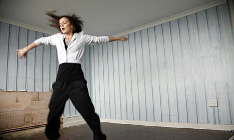
This can be demonstrated by this image, taken from Fish Tank where Mia is situated on the left hand side, as she is vulnerable in Connors presence. He is in controll and dominating, situated on the right.

The rule of thirds can also be used to encourage audiences to think about the space left surrounding a character, for example it could be used to make a character appear small in comparrison to their surroundings creating vulnerability. In this image we can see Mia is not situated centerally, but placed on the left hand side of the frame.


When shooting our short film, particularly the silhouette scenes I want to ensure our character is placed to the left hand side, emphasisng her fragility and creating a vast space surrounding her.

Tuesday, 5 April 2011

Filming considerations 180 degree rule

Whilst filming we should be aware of techniques that will enable us to produce a professional, dynamic film.


The 180 degree rule states that two characters within the same scene should always maintain a left right relationship, they must always be facing the same side. Crossing over the imaginary axis between the characters will disorientate the audience, and could break the flow of the sequence.


This scene from the dark knight demonstrates the 180 degree rule, in an interrogation of the joker.

Laura Mulvey

Laura Mulvey's male gaze theory is something I have considered whilst making our short film, it states that there is unequal relationship between women and men in film, with women being viewed purely as sexual objects - men view, women are viewed. I have demonstrated the difference below.


Mia from fish tank opposes this theory, as her character is not supposed to be visually admired and gazed upon but instead developed through her personality and life troubles.
As opposed to Mias mother, whos is extroverted and designed for male attention as well as her personality and characteristics.

PHOTO HERE